


Redesigning a Menu Builder to Empower Ecommerce Sellers
Redesigning the experience of creating and editing menus in an e-commerce admin panel.

Project type
e.tres SAAS eCommerce Platform redesign
Working at
e.tres
Duration
2 Weeks
Role
Lead Product Designer
Team
Lead Product Designer
UX/UI Designer
Product Manager
Developer
Project Overview
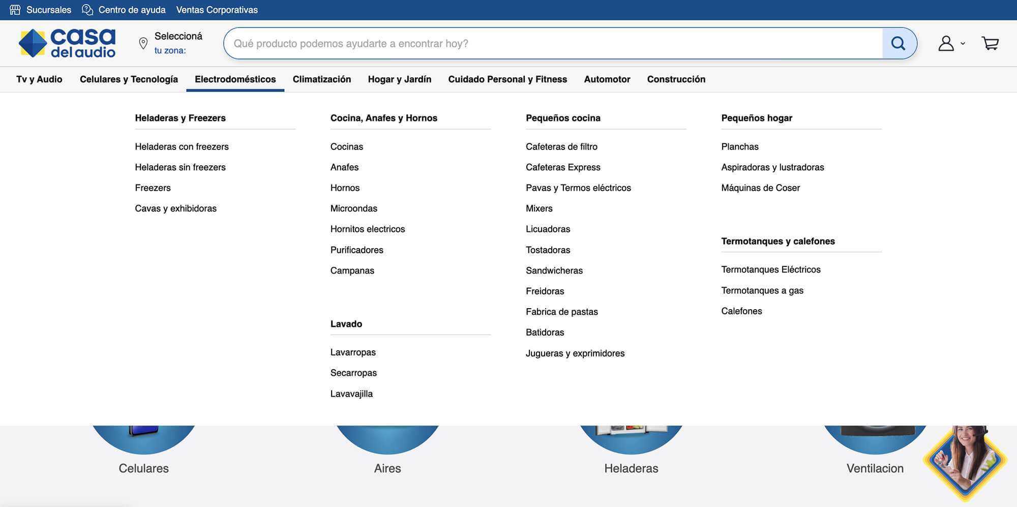
e3stores is a fast-growing ecommerce SaaS platform used by a wide range of clients — from global brands like Samsung and Garmin to local entrepreneurs and competing in Latin America with major ecommerce platforms like Magento, Shopify, and Vtex.
Although e3stores had grown rapidly, its platform had been evolving for years with a developer-centered mindset. The product prioritized functionality over usability, forcing users to rely on tutorials and support teams to complete basic tasks.
As Lead Product Designer, I was tasked with redesigning the Menu Builder section in the admin panel, a critical tool for building site navigation. Leading this project was the first step in a larger effort to modernize the platform and move toward user-centered design.
My Goals & Role
My goal was to transform a developer-centric tool into an intuitive experience, enabling users to manage complex menus independently and reducing their dependency on training or customer support.
As the Lead Designer, I focused on addressing high-impact support issues related to the hierarchy and organization of information. I guided designers and closely collaborated with developers, the project manager, and stakeholders to ensure the new solution was intuitive, flexible, and aligned with the needs of a diverse user base while maintaining UI consistency across the platform.
Understanding the users
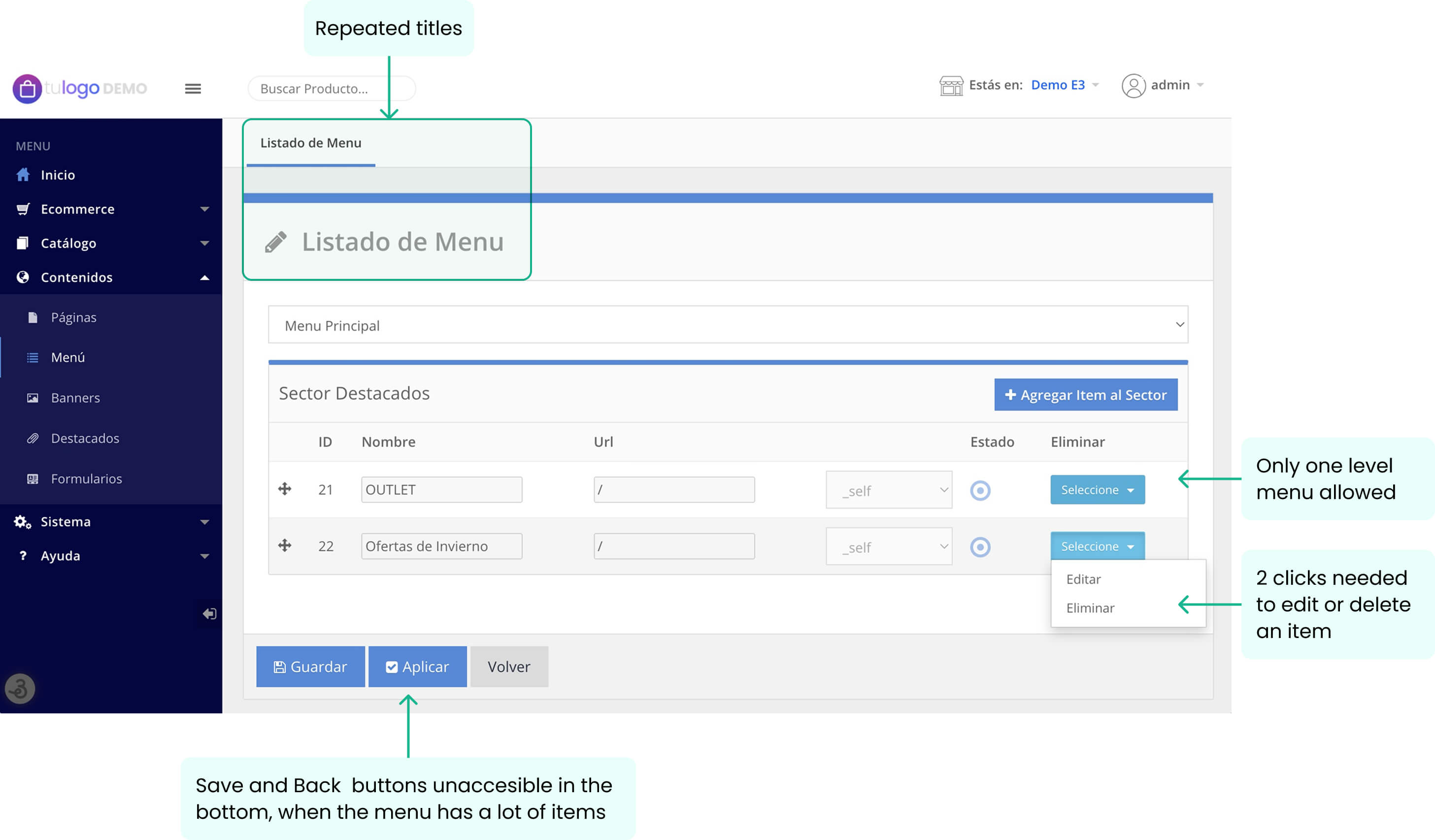
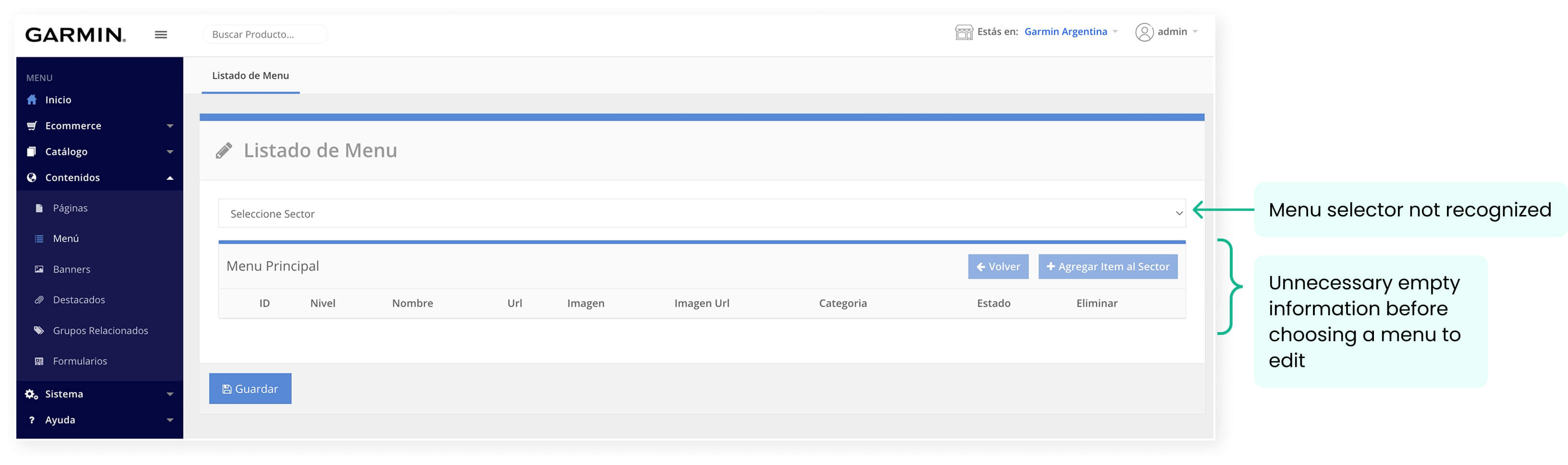
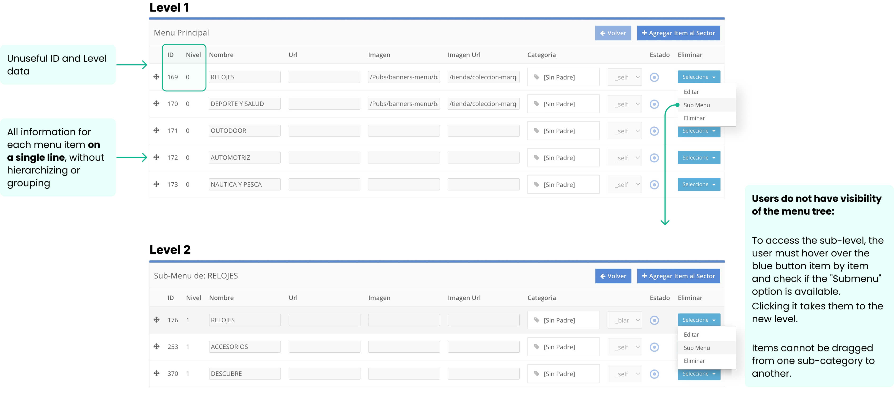
The existing Menu Builder was limited and rigid:
- Single-level menus had to be pre-configured by e3stores’ technical team.
- Product categories were auto-loaded and could not be customized or combined with other content.
Through interviews with clients, support teams, and trainers, we identified clear user needs that were not being met:
- Create multi-level menus independently.
- Mix product categories and institutional content in one menu.
- Include automatic menus generated from filters inside categories.
- Include custom links to create different approaches to browsing the product catalog.
- Add banners for promotions within the first level of the menu structure.
- Easily control navigation without relying on technical teams.
These insights highlighted the need for a flexible, user-centered solution that would adapt to clients of all sizes and technical expertise.
Design Process: Rethinking the Experience
When we joined the project, developers had already started building a first version — but it didn’t align with user needs and lacked UX thinking.
Our first step was to analyze the flow for creating menus, identifying issues and opportunities to improve usability and flexibility.
Then we worked on redefining the user journey, focusing on making complex tasks like multi-level menu creation feel simple and intuitive.
Since most users operate on desktop, we prioritized a desktop-first design while ensuring all core actions would also work smoothly on mobile.
The Solution
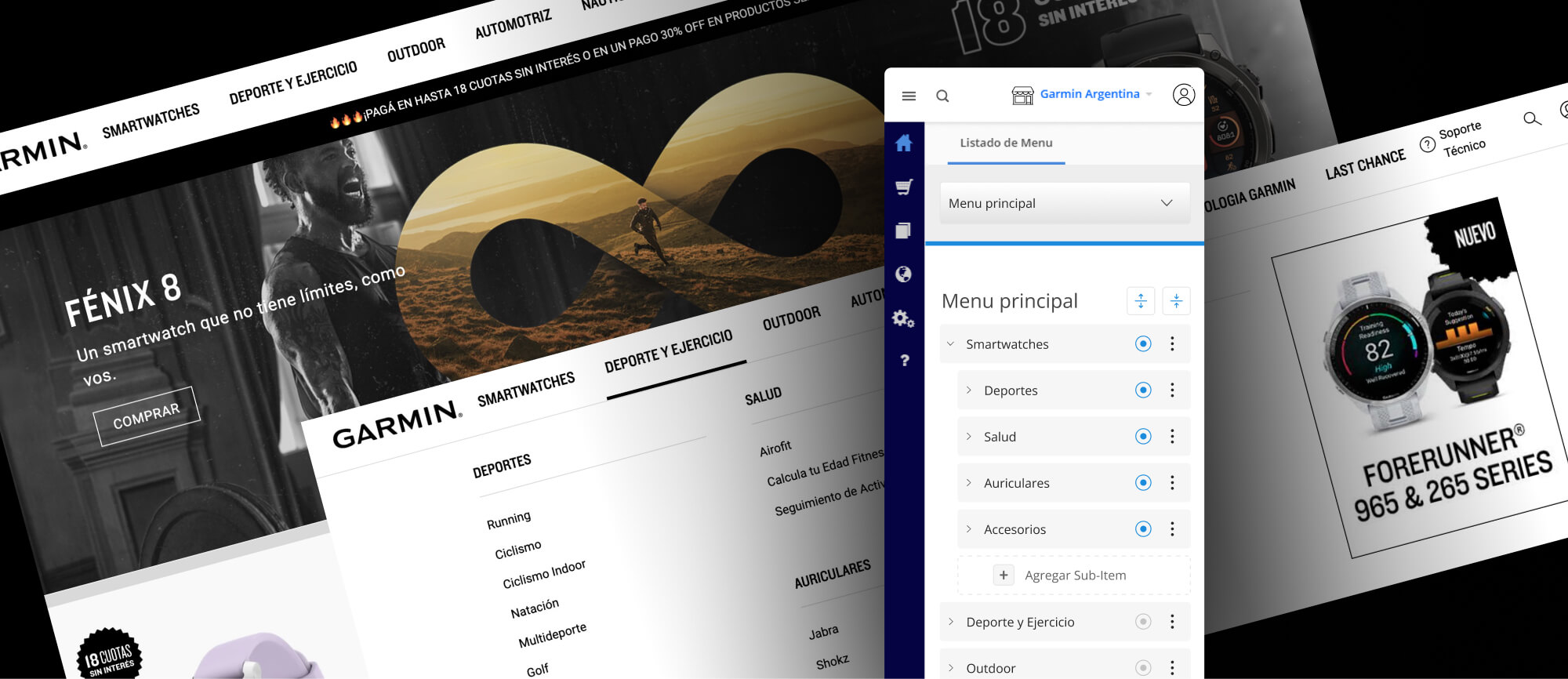
The result was a completely reimagined Menu Builder that gives users full control over their store navigation, with a focus on simplicity and flexibility:
- Drag-and-drop interface to build multi-level menus intuitively.
- Ability to combine categories, content pages, and custom links.
- Option to insert banners directly in menus, enabling stores to manage marketing without developer intervention.
- Live previews of menu hierarchy to prevent errors and give users confidence.
→ Main Selector
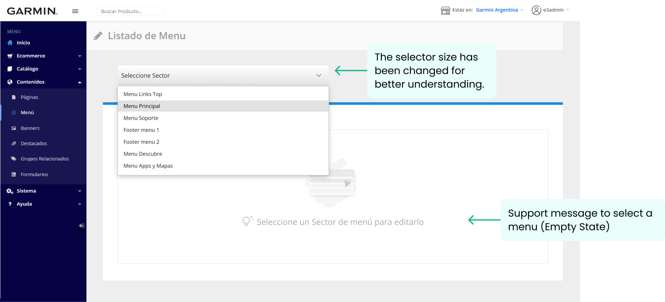
→ Category tree
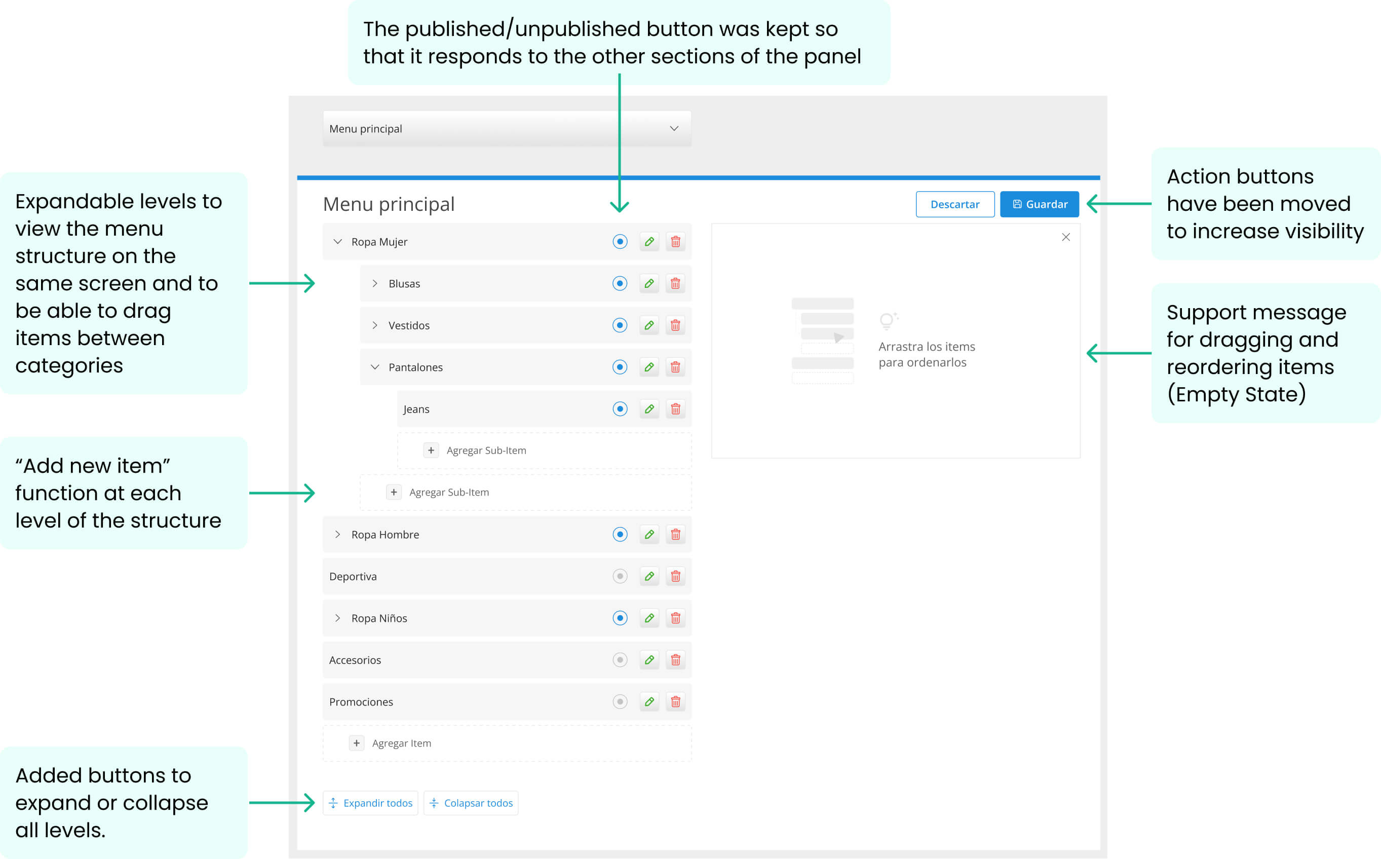
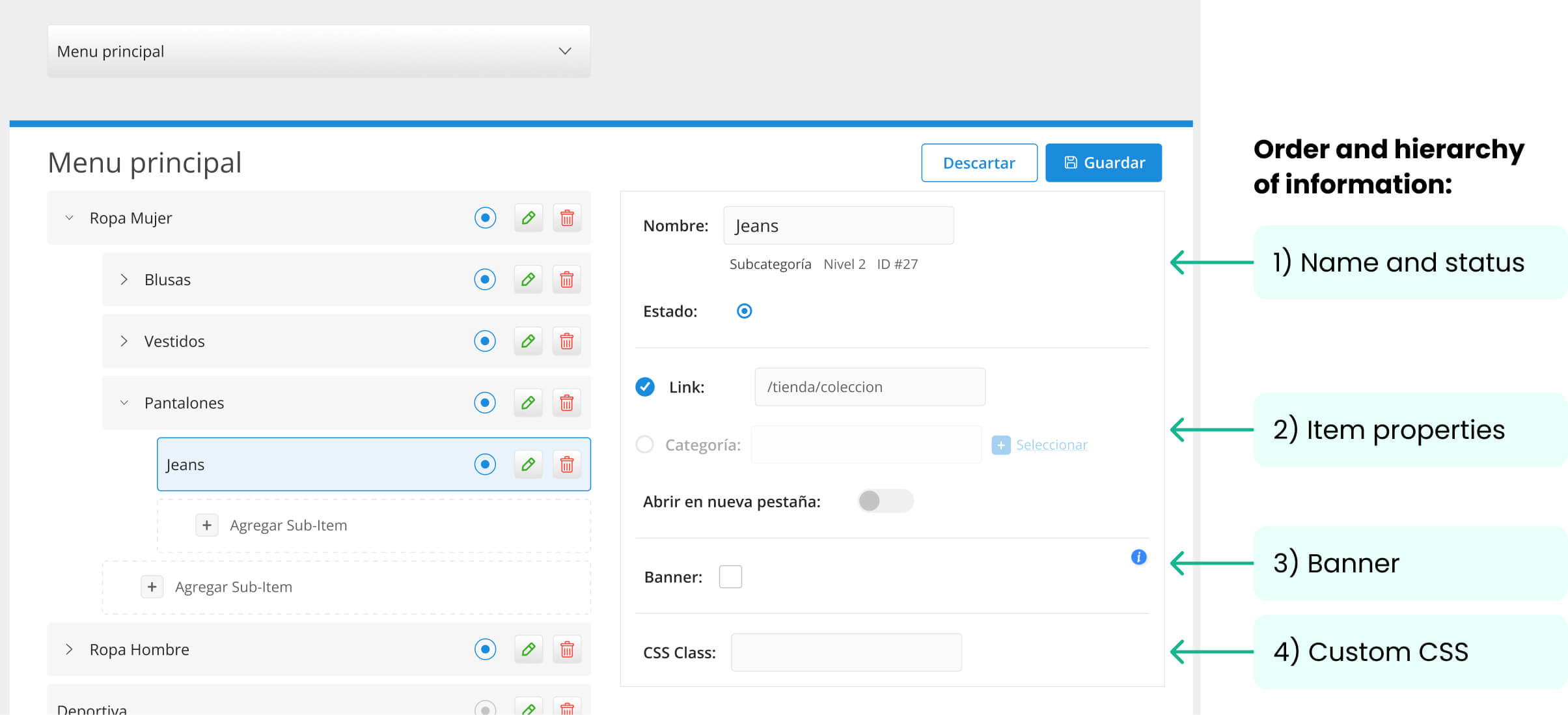
→ Item elements – Order & Hierarchy
- Name and status. ID and level as secondary data (they can´t be modified by the user).
- Item properties:
— Is the link manually entered, or should it automatically pull categories from the catalog?
— User-friendly option to open in a new tab, avoiding technical terms like _self or _blank for better accessibility. - Will this item display a banner?
- Possibility of adding CSS to the item (new functionality to highlight items in the menu).
→ Adding a banner
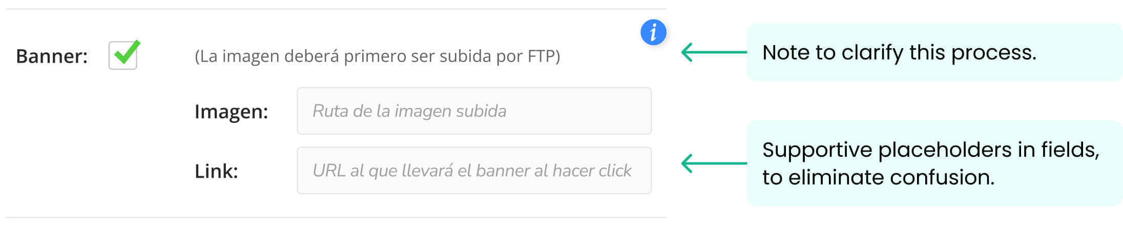
At this stage, it was not technically possible to upload an image directly in this section, so images must first be uploaded via FTP. A note was added to clarify this process.
During user testing, we found that users struggled to differentiate between the image path link and the CTA link for the banner. To address this, we added supportive placeholders to eliminate confusion.
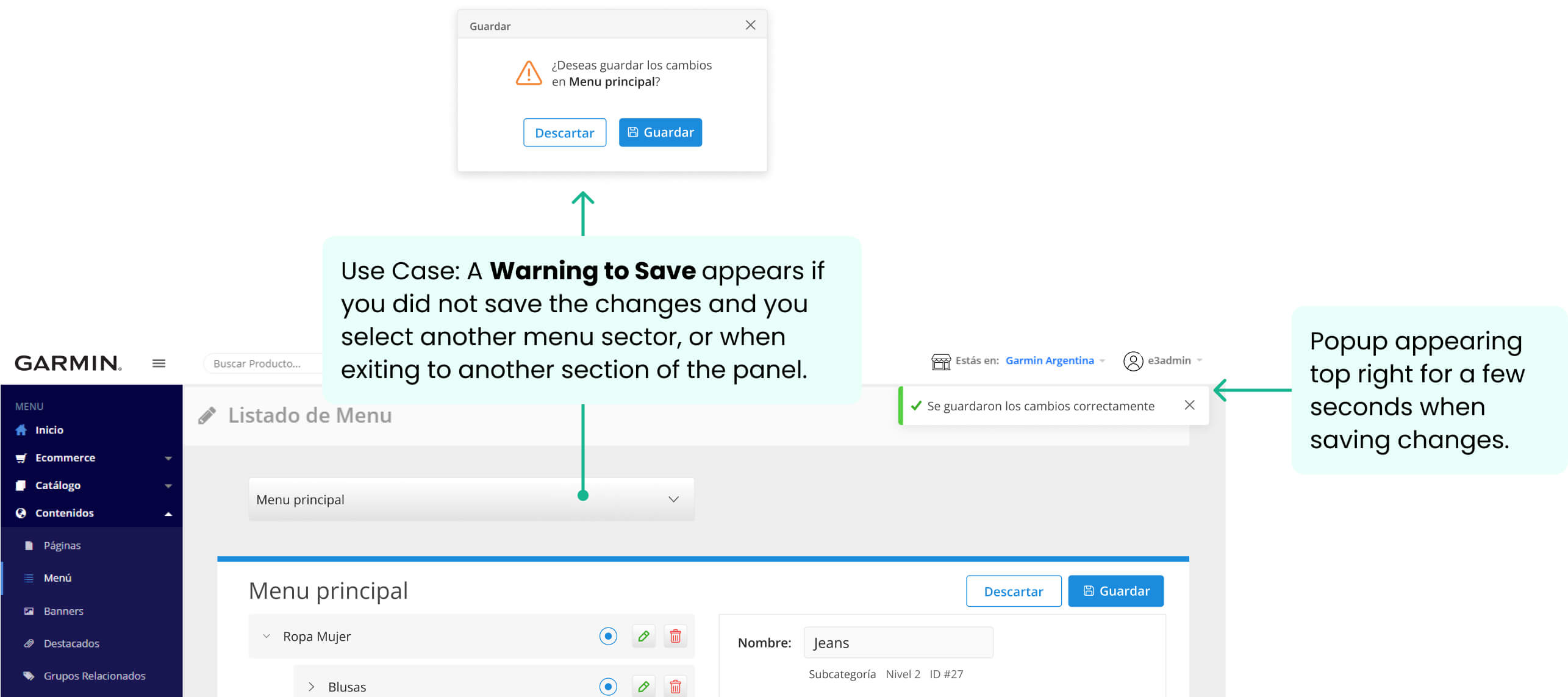
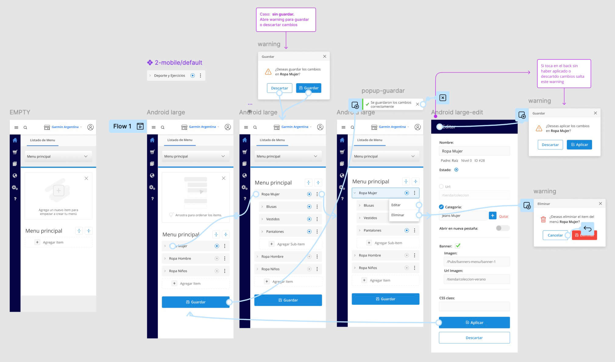
→ Save & Edit Warnings
In the old version, when editing a menu and switching the main selector to another menu, all changes were lost without any warning or prompt to save.
The new design prevents these errors by integrating safeguards into the flow, ensuring users are notified before leaving unsaved changes. Visual indicators and confirmation prompts were added to reinforce system visibility and improve the saving process.
Ensuring a Seamless Mobile Experience
While most users configured their menus from a desktop, mobile support was not an afterthought. We ensured that all functionalities remained accessible and fully operational on mobile, maintaining a smooth and consistent experience across devices.
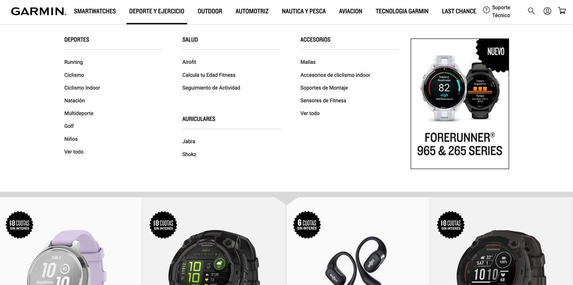
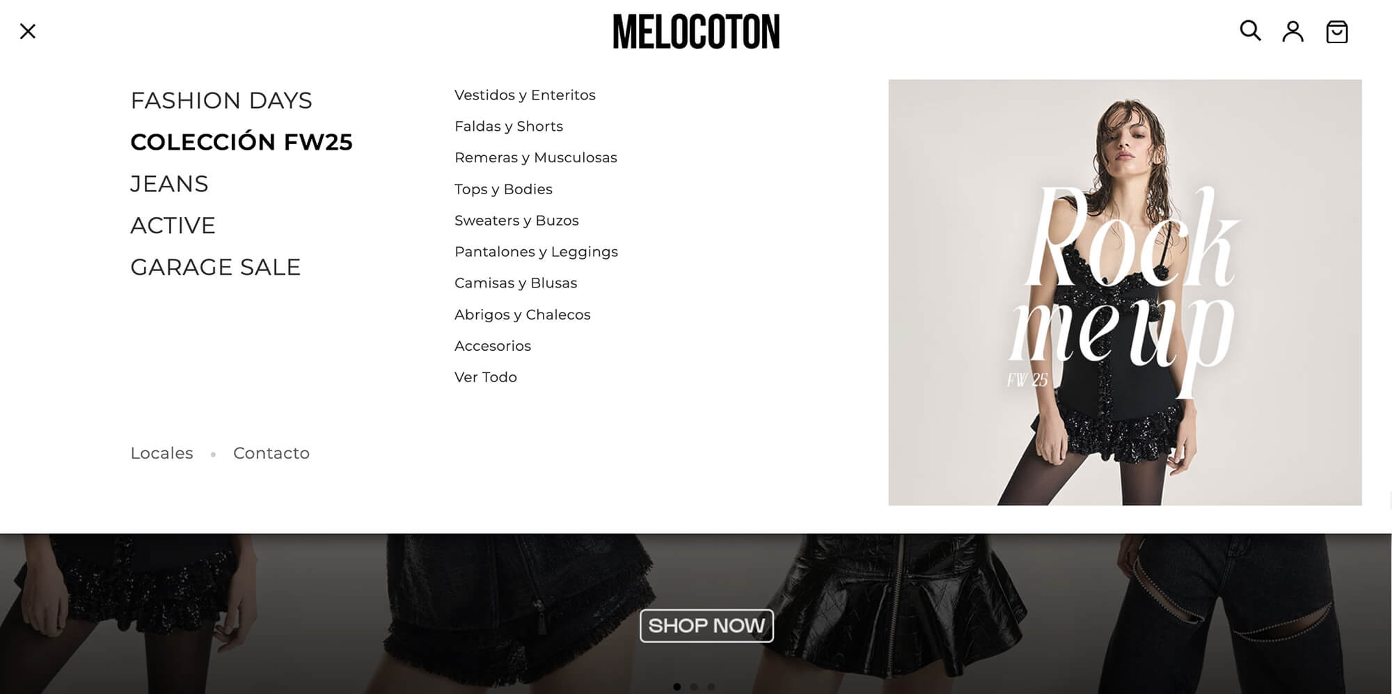
Adapting to Different Storefronts
The new Menu Builder allows each store to customize its navigation while maintaining consistency across the platform.
Here’s how different storefronts have implemented their menus, showcasing flexibility and brand adaptation.
Results & Impact

The redesigned menu builder was first implemented on Garmin‘s sites, followed by Samsung’s, and then progressively rolled out to over 10 additional clients.
After launching the redesigned Menu Builder, feedback was overwhelmingly positive.
We measured success through Hotjar surveys focusing on Customer Effort Score (CES) and Customer Satisfaction (CSAT):
- Customer Effort Score: 93.3 — Users found it easy to create menus on their own.
- Customer Satisfaction: 96.6 — High satisfaction with the overall experience.
- 90% Reduction in Menu-Related Tickets: Support teams reported a drastic drop in menu builder-related queries, reflecting the success of the self-service approach.

Outcomes & Value Provided
The Menu Builder redesign delivered a scalable and intuitive solution that significantly improved both user experience and internal operations.
By empowering sellers to create and manage complex menus on their own, the platform reduced support dependency and freed up internal teams to focus on growth.
Key stakeholders highlighted how the solution balanced flexibility and simplicity, enhancing the platform’s competitiveness in a crowded ecommerce market.
Overall, this project laid the foundation for a more user-centered product experience, aligned with e3stores’ long-term vision of scalable and efficient ecommerce management.
Next Steps
One of the remaining challenges is how users upload banner images, which still requires using FTP.
To solve this, we are proposing a direct upload feature integrated within the Menu Builder, eliminating the need for external processes and fully empowering users to manage their menus.
👇
Wanna Try It?
See the redesigned Menu Builder in action and explore the full Desktop Experience. (Sorry, it’s in Spanish! I’ll update it… someday. 😅)